Visuals in Turkish · the full text is on this page
Tools · Web
What does your brand's font say? 7 free fonts and the personality of each
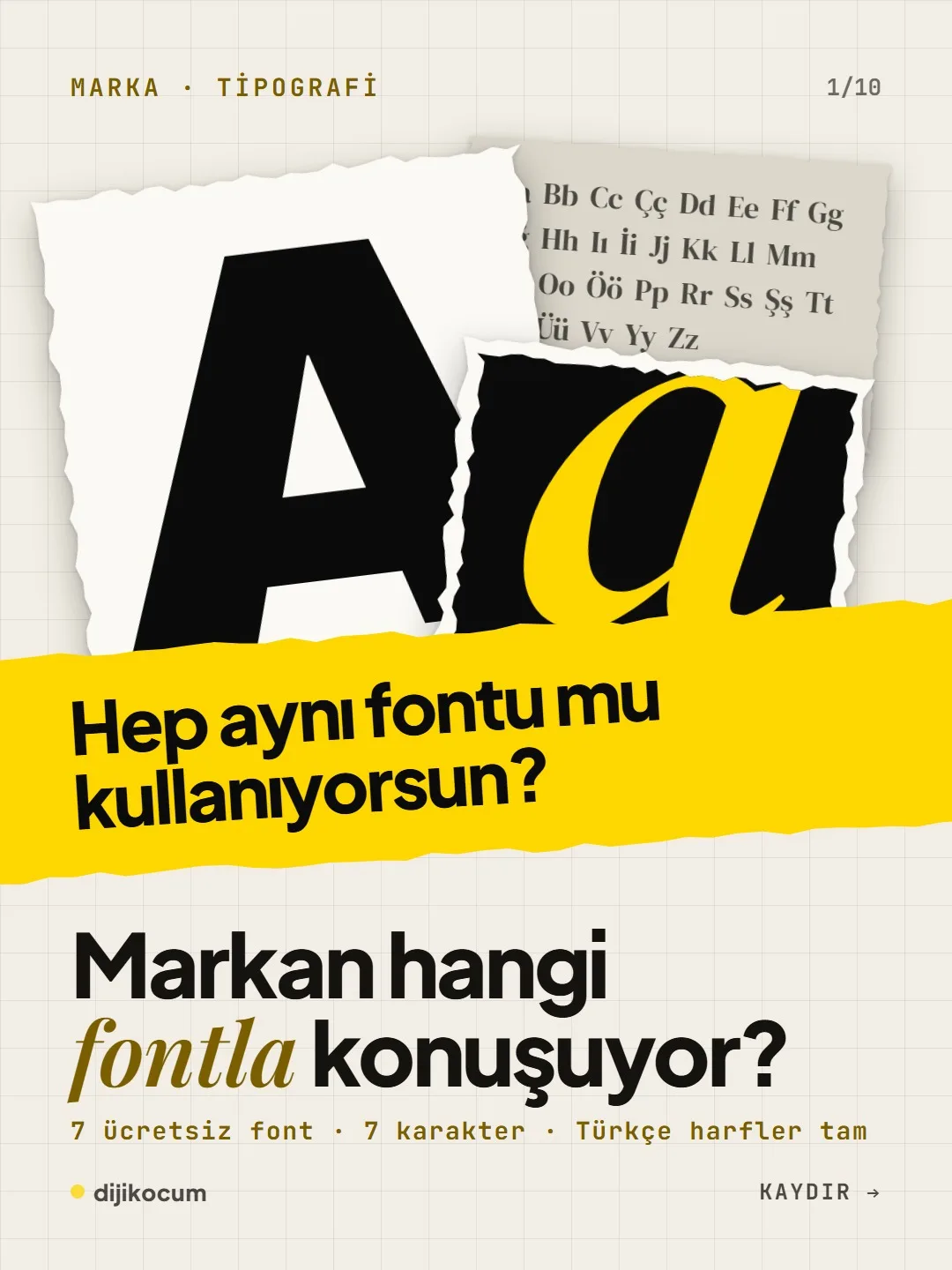
Seven free typefaces, seven distinct voices; all of them fully support the special Turkish letters (the g with a breve, the s with a cedilla, the dotless i and the dotted capital I).
Short answer
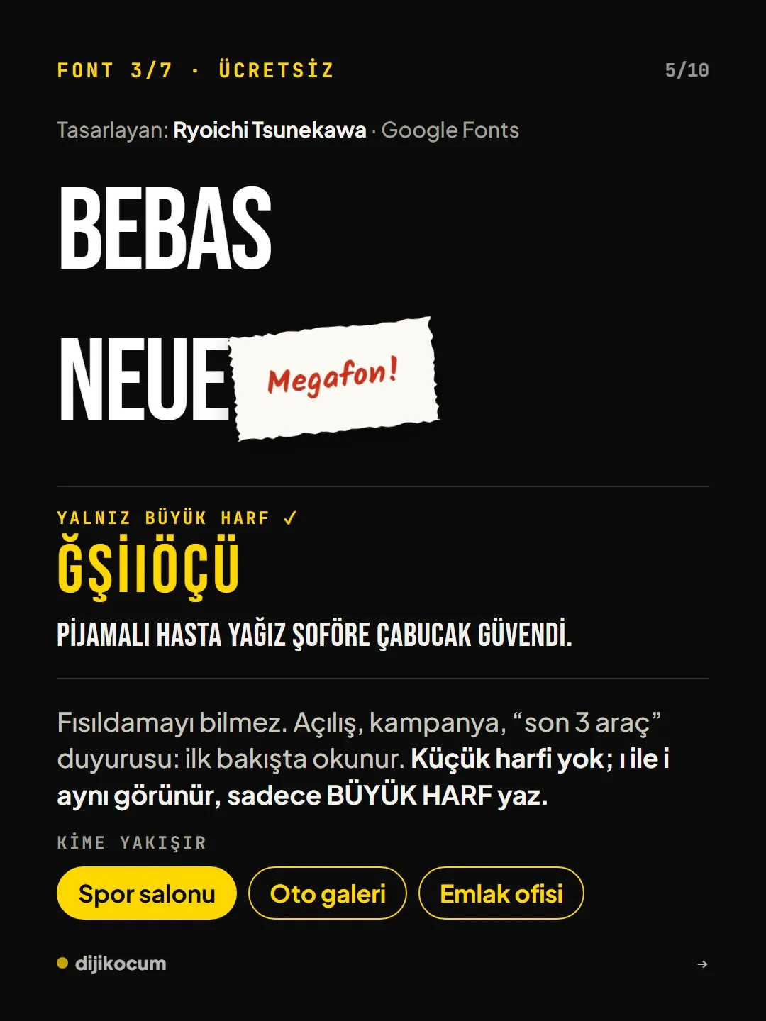
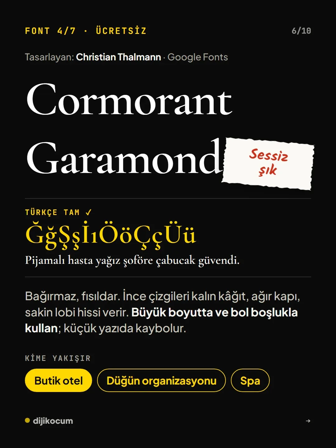
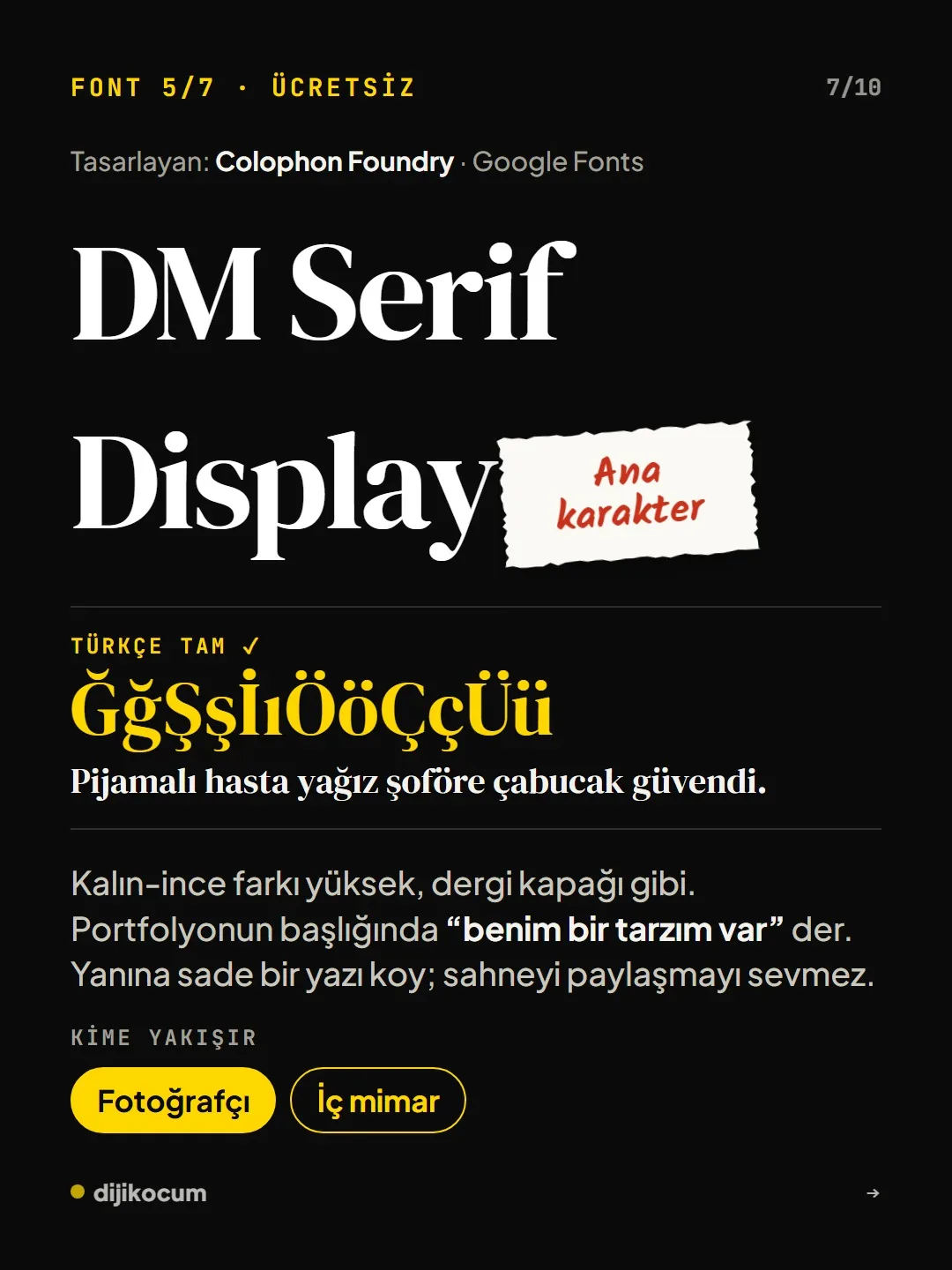
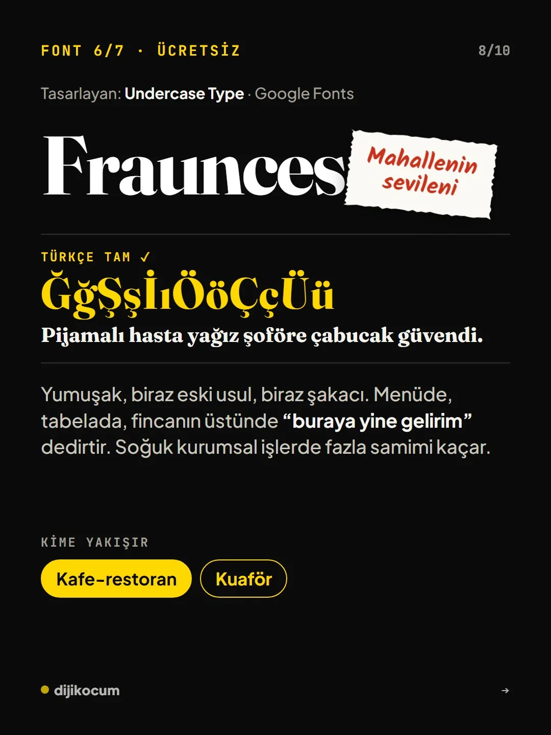
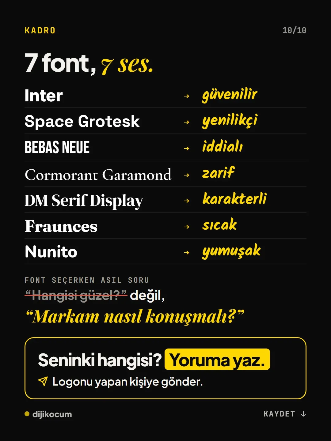
When choosing a font for a brand, the question isn't which one is pretty, but how the brand should sound. Seven free Google Fonts typefaces carry seven distinct personalities: Inter is trustworthy, Space Grotesk innovative, Bebas Neue bold, Cormorant Garamond elegant, DM Serif Display full of character, Fraunces warm and Nunito soft. All of them fully support Turkish characters; Bebas Neue should be used in capitals only.
4 steps · 2 min read · · Turan Yasin Salcı
Step by step · 4 steps
0/4 checked · saved in this browser only
First, define your brand's voice.
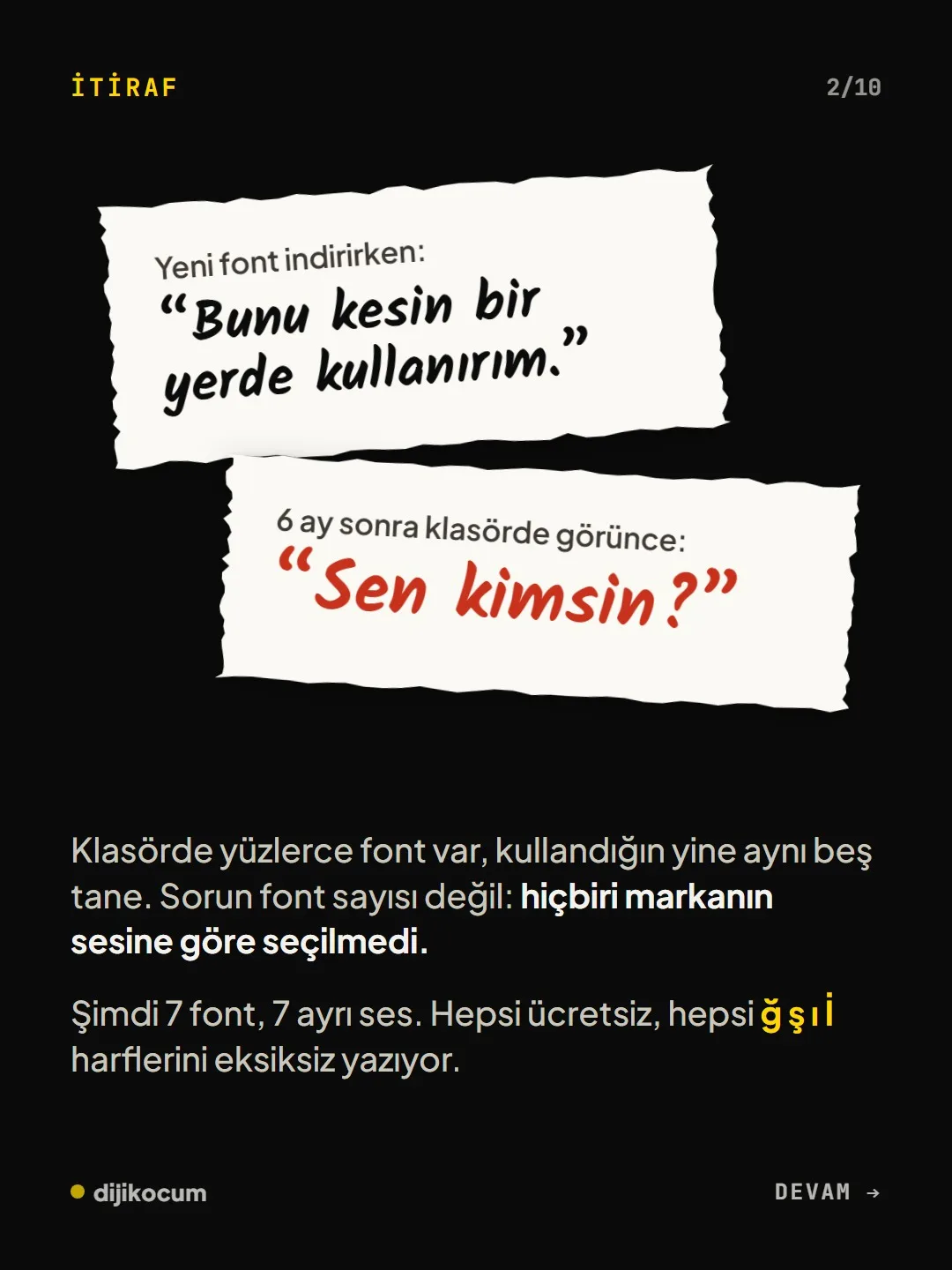
The real question isn't “Which one is pretty?” but “How should my brand sound?”. Trustworthy, innovative, bold, elegant, full of character, warm or soft: write down in one word what your customer should feel the first time they see you.
Choose the font that matches the voice.
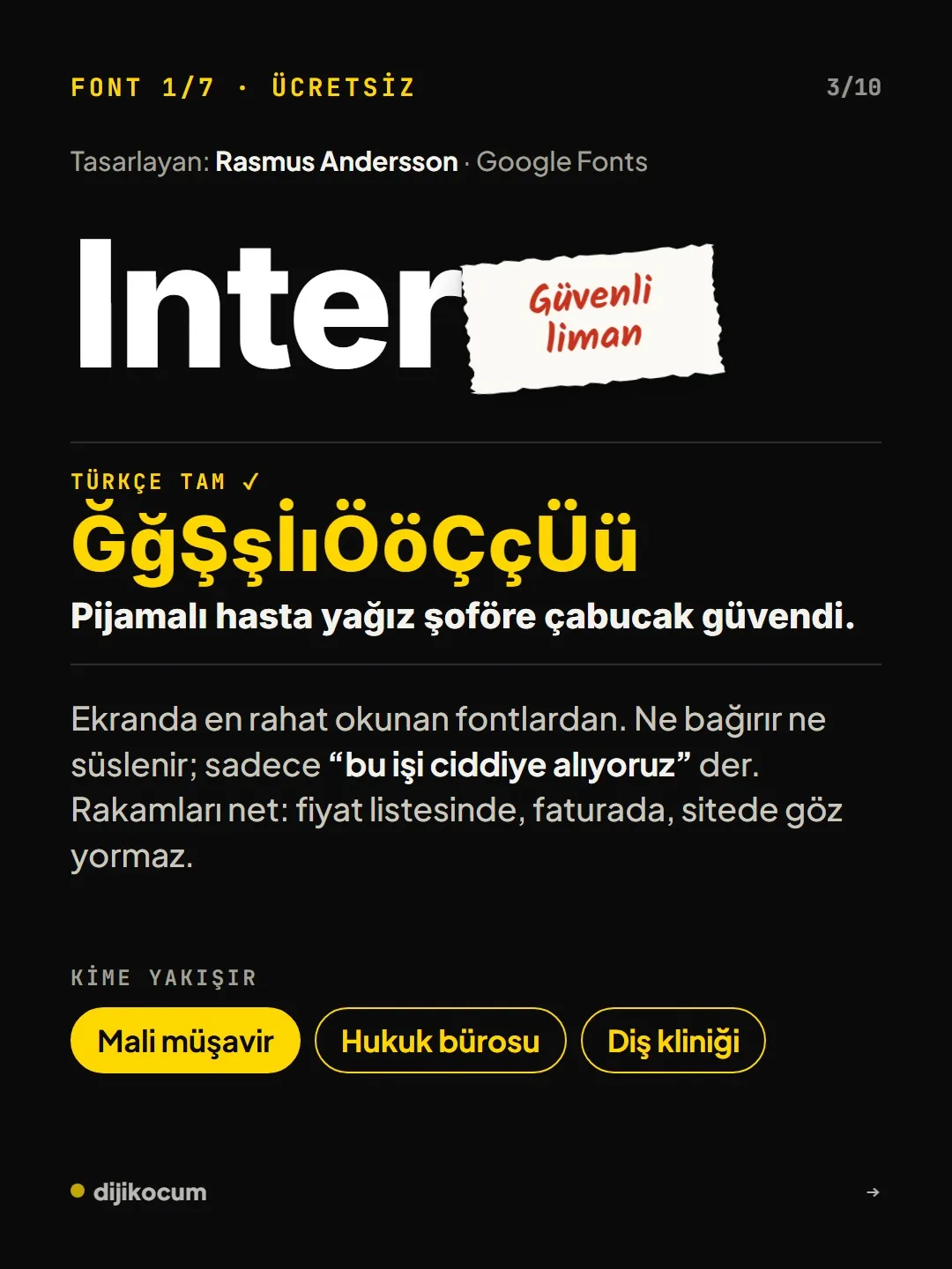
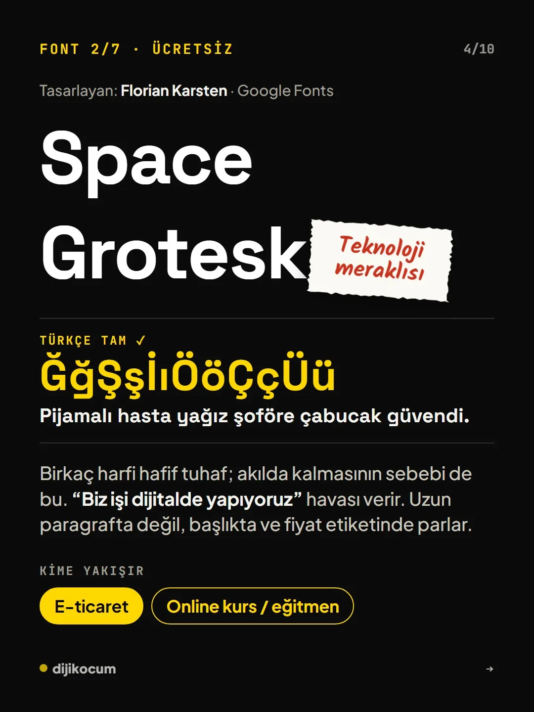
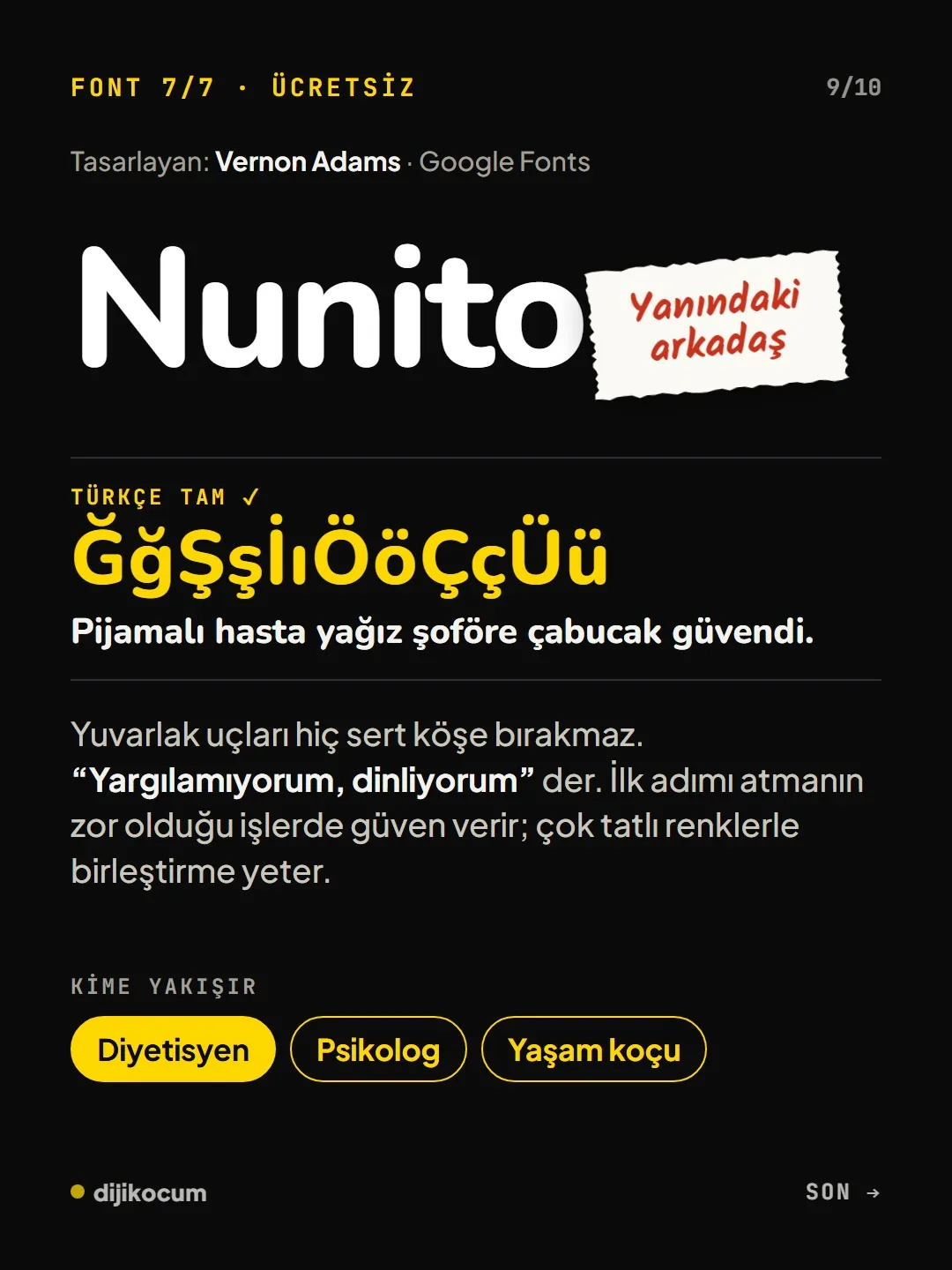
Inter is the safe harbor (accountant, law firm, dental clinic), Space Grotesk the tech enthusiast (e-commerce, online course), Bebas Neue the megaphone (gym, car dealership, real estate office), Cormorant Garamond quiet and chic (boutique hotel, wedding planning, spa). DM Serif Display is the main character (photographer, interior designer), Fraunces the neighborhood favorite (café-restaurant, hair salon), Nunito the friend by your side (dietitian, psychologist, life coach).
Test the Turkish letters.
Type the sentence below (a Turkish pangram) in the font you chose and check whether the special Turkish letters (the g with a breve, the s with a cedilla, the dotless i, the dotted capital I) break apart. Bebas Neue has no lowercase letters, so the dotless i and the regular i look the same; use it in capitals only.
Pijamalı hasta yağız şoföre çabucak güvendi. PİJAMALI HASTA YAĞIZ ŞOFÖRE ÇABUCAK GÜVENDİ.Use it in the right place.
Use Cormorant Garamond at large sizes and with plenty of white space; it gets lost in small text. Space Grotesk shines in headlines and on price tags, not in long paragraphs; pair DM Serif Display with a plain typeface.
Sources
- AGoogle Fonts: Inter, Space Grotesk, Bebas Neue, Cormorant Garamond, DM Serif Display, Fraunces, NunitoPrimary source · checked: October 4, 2026
- DDijiKoçum brand font guide (7 fonts)Our own data · checked: October 4, 2026
[A] primary source · [B] industry research · [C] practitioner · [D] our own data
Frequently asked questions
Which fonts support Turkish characters?
All seven fonts in the carousel support the special Turkish letters: the g with a breve, the s and c with a cedilla, the dotless i, the dotted capital I, and the o and u with an umlaut. Bebas Neue has no lowercase letters; since the dotless i and the regular i look the same, use it in capitals only.
Which font suits a café or a hair salon?
Fraunces: soft, a little old-fashioned and playful; on a menu or a sign it makes people say “I'll come back here.” For cold corporate work, though, it comes across as too friendly.
Next step
Let’s look at your site together.
Free Digital Checkup: a health score for your website, your ads and your visibility in AI search, plus what to fix first. 3 minutes.
More guides
Tools
How to transform product photos with ChatGPT Images 2.5: 20 ready-made image prompts (step by step)
26 steps · 14 min
Tools
5 Free Animation Skills for Claude Code: How to Install Three.js, GSAP, design-dna, LottieFiles and Genjutsu (Step by Step)
16 steps · 9 min
Tools
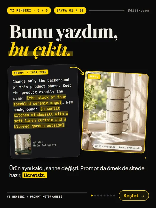
How to Use the Prompt Library and Prompt Builder: Copy a Ready-Made Prompt, Fill In the Blanks
9 steps · 7 min